Borders
Borders can be used for many things, for example as a decorative element or to underline a separation of two things. CSS gives you endless options when using borders in your pages. We will discuss the following things in our this tutorial.
- border-width
- border-color
- border-style
- border
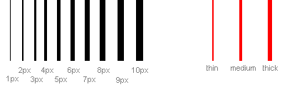
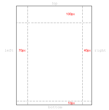
The width of borders [border-width]
The width of borders is defined by the property border-width, which can obtain the values thin, medium, and thick, or a numeric value, indicated in pixels. The figure below illustrates the system:
The color of borders [border-color]
The property border-color defines which color the border has. The values are the normal color-values for example "#123456", "rgb(123,123,123)" or "yellow" .
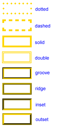
Types of borders [border-style]
There are different types of borders to choose from. Below are shown 8 different types of borders as Internet Explorer 8 interprets them. All examples are shown with the color "gold" and the thickness "thick" but can naturally be shown in other colors and thicknesses.
The values none or hidden can be used if you do not want any border.
Examples of defining borders
The three properties described above can be put together by each element and thereby produce different borders. To illustrate this, we will take a look at a document where we define different borders for <h1>, <h2>, <ul> and <p>. The result may not be that pretty but it illustrates some of the many possibilities:
 h1 {
  border-width: thick;
  border-style: dotted;
  border-color: gold;
 }

 h2 {
  border-width: 20px;
  border-style: outset;
  border-color: red;
 }

 p {
  border-width: 1px;
  border-style: dashed;
  border-color: blue;
 }

 ul {
  border-width: thin;
  border-style: solid;
  border-color: orange;
 }
The Result:
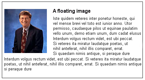
Borders
Iste quidem veteres:
- inter ponetur honeste, qui vel mense brevi vel toto est iunior anno.
- Utor permisso, caudaeque pilos ut equinae paulatim vello unum, demo etiam unum, dum cadat elusus
- ratione ruentis acervi, qui redit in fastos et annis miraturque.
Quod si tam Graecis novitas
Ennius et sapines et fortis et alter Homerus:
- critici
- dicunt
- leviter curare
- videtur
- quo promissa
Hos ediscit et hos arto stipata theatro spectat Roma potens; habet hos numeratque poetas ad nostrum tempus Livi scriptoris ab aevo, si nimis antique, si dure.
Interdum volgus rectum videt, est ubi peccat. Si veteres ita miratur laudatque poetas, ut nihil anteferat, nihil illis comparet, errat. Si quaedam nimis antique, si peraque dure dicere credit eos, ignave multa fatetur, et sapit et mecum facit et Iova iudicat aequo.Non equidem insector delendave carmina Livi esse reor, memini quae plagosum mihi parvo Orbilium dictare; sed emendata videri pulchraque et exactis minimum distantia miror. Inter quae verbum emicuit si forte decorum, et si versus paulo concinnior unus et alter, venditque poema.
Indignor quicquam reprehendi, non quia crasse compositum illepedeve putetur, sed quia nuper, nec veniam antiquis, sed honorem et praemia posci. Recte necne crocum floresque perambulet Attae fabula si dubitem, clament periisse pudorem cuncti paene patres, ea cum reprehendere coner, quae gravis Aesopus, quae doctus Roscius egit; vel quia nil rectum, nisi quod placuit sibi, ducunt, vel quia turpe putant parere minoribus, et quae imberbes senes.
It is also possible to state special properties for top-, bottom-, right- or left borders. The following example shows you how:
 h1 {
  border-top-width: thick;
  border-top-style: solid;
  border-top-color: red;

  border-bottom-width: thick;
  border-bottom-style: solid;
  border-bottom-color: blue;

  border-right-width: thick;
  border-right-style: solid;
  border-right-color: green;

  border-left-width: thick;
  border-left-style: solid;
  border-left-color: orange;
 }
The Result:
Different colors on borders
Compilation [border]
As it is also the case for many other properties, you can compile many properties into one using border. Let us take a look at an example:
 p {
  border-width: 1px;
  border-style: solid;
  border-color: blue;
 }
Can be compiled into:
 p {
  border: 1px solid blue;
 }
Summary
In this lesson you have learned about the endless options CSS gives you when using borders in your pages.
In the next lesson, we will look at how you define the dimensions in the box model - height and width.


 About
About Tags
Tags Popular


